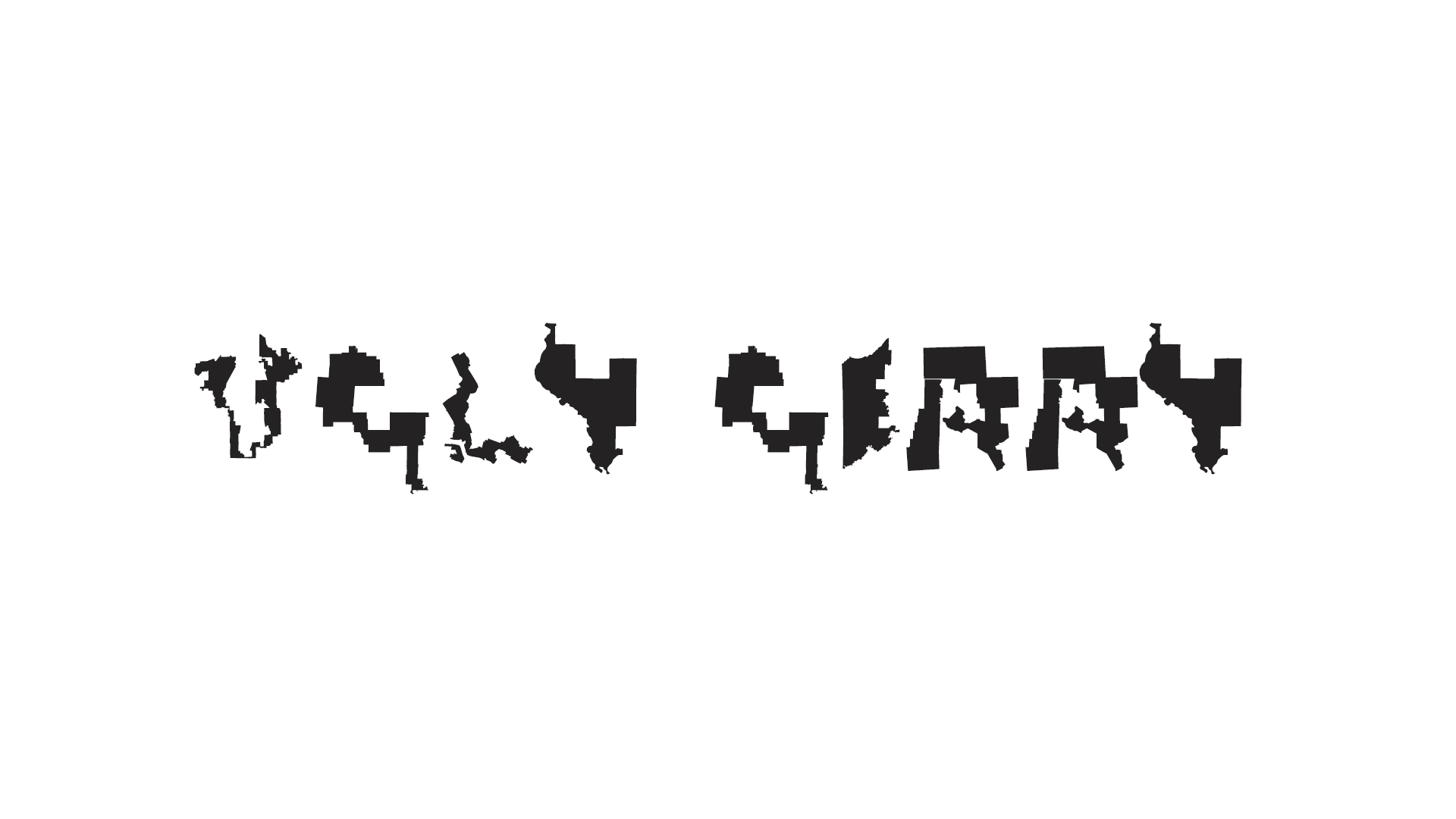
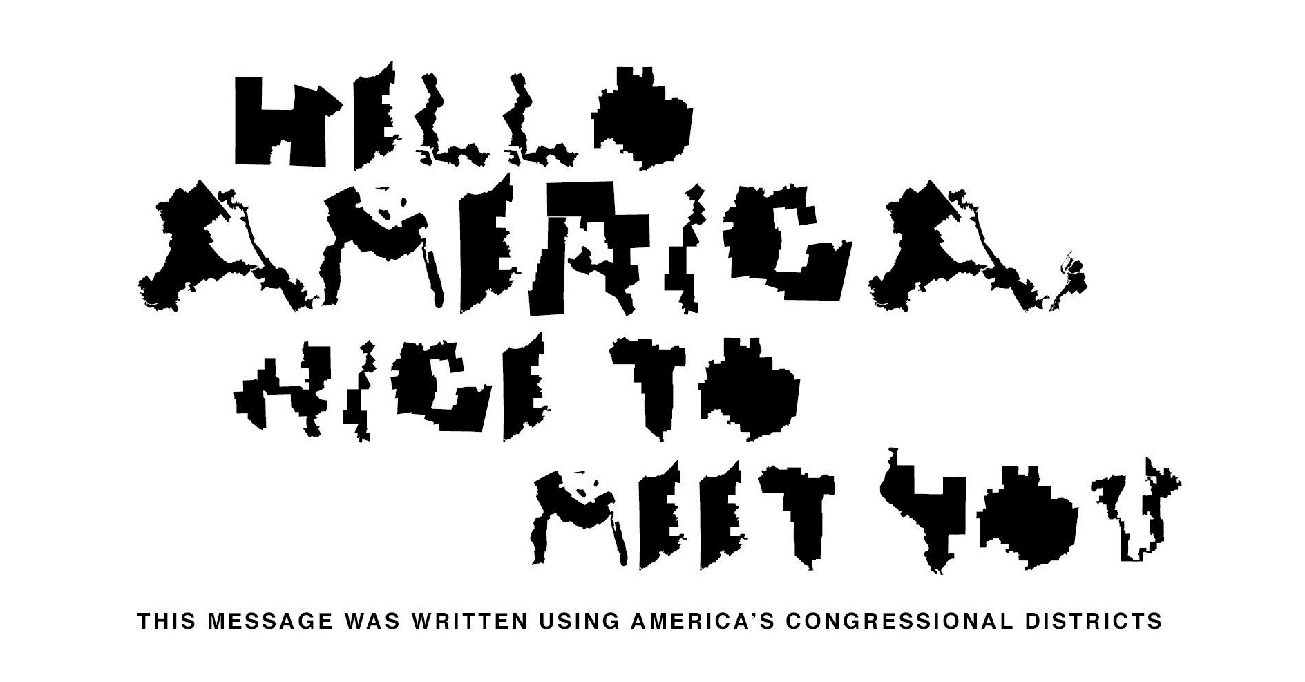
Concept and font by creatives Ben Doessel and James Lee, creative technology by HoneyWired.
Robert Reich ⭑ Hyperallergic ⭑ The Observatory ⭑ Kotke ⭑ The Fulcrum ⭑ Fonts Arena ⭑ Cleveland.com ⭑ Detroit Free Press ⭑ Gigazine ⭑ Yello ⭑ Making Book ⭑ Actualitté ⭑ MapLab ⭑ Bluff Country Newspaper ⭑ Flowing Data ⭑ Second Nexus ⭑ The Digital Reader ⭑ Web Urbanist ⭑ AdAbility ⭑ Daily News Ghana


Analysis: How do you spell "gerrymandering is bad?" With a font made out of preposterous districts. https://t.co/65Df6tzJWu
— The Washington Post (@washingtonpost) August 3, 2019
"In #NH, the two Congressional districts are not gerrymandered, but the executive council, senate and house districts certainly are." @grayno2 https://t.co/Xk2s6beN5W
— NH Senate Democrats (@NHSenateDems) August 12, 2019
*Quote c/o "UglyGerry" - a font created by U.S. Congressional Districts#nhpolitics pic.twitter.com/USrLs3y5Q4
Gerrymandering undermines our democracy. That’s why I cosponsored the #ForThePeople Act, which would set up nonpartisan, independent redistrict commissions — aimed at stopping people in power from sabotaging your voice. pic.twitter.com/NL7XGYdoEY
— Mark Takano (@RepMarkTakano) August 12, 2019
3 of Ohio's districts made the cut for a new font Ugly Gerry. District 12 is "B", District 4 is "G" & District 10 is "R". We ???? that folks across the country detest gerrymandering as much as we do. Thanks to the creators for keeping it in the conversation. https://t.co/LQgeLJLTqe
— ACLU of Ohio (@acluohio) August 2, 2019
This is incredible: a font made from gerrymandered districts https://t.co/5JRGC7lUEB pic.twitter.com/0u1rU6wKuV
— Nick Corasaniti (@NYTnickc) August 1, 2019
incredibly well done both technically and thematically
— pete bing-gazer (@peterbinggeser) August 2, 2019
- dynamic meta data for summary cards
- location based representative detection
- painless Twitter integration via Tweet intent links https://t.co/HnBSJDLADu
This is both depressing and amazing https://t.co/bp5xUfbids pic.twitter.com/tbglhsGBUD
— Jeff Singer (@DarthJeff90) August 1, 2019
Meet Gerry, the font created using the shapes of gerrymandered Congressional districts. Brilliant. Also, profoundly dispiriting. https://t.co/hIwwSwPTzw pic.twitter.com/7flDW2R5hn
— Ben Wikler (@benwikler) August 1, 2019
Attending the launch of the Harvard Data Science Review. Second half of the day is on the mathematics of gerrymandering. Here’s a font made up of tortured districts. pic.twitter.com/J6w1nL1jPM
— Mark Hansen (@cocteau) October 25, 2019
today's best thing: there's a font made entirely out of maps of gerrymandered congressional districts at https://t.co/MACLU3Ykx0 pic.twitter.com/8r4wpH9k9s
— Sam Thielman (@samthielman) August 1, 2019
Hey @UglyGerry , here's the Constitution made appropriately illegible by you. https://t.co/pBul5L6R9A
— Michael A. Brodeur (@MBrodeur) August 2, 2019
If the exact intersection of your interests is graphic design and a deeply abiding hatred of partisan gerrymandering, then have I got the font for you: pic.twitter.com/w1j6iQvANh
— Morgan Baskin (@mhbaskin) August 1, 2019
There’s a font made from gerrymandered congressional districts...
— ???? Mark Helenowski (@MarkHelenowski) August 1, 2019
And I just so happen to sit next to Leading Voting Rights Expert @AriBerman.
So, you know it had to happen ???????? pic.twitter.com/qmiLShnnB9
So gerrymandering (one of my favourite words) now has its own font. Can't vouch for whether these are legit US congressional districts but... cool font. https://t.co/EbpkFXqcsr
— Kerry Campbell (@kerrywcampbell) August 27, 2019
A font created from gerrymandered districts: https://t.co/8tgCxGaEqp (via @Beschizza)
— Clive Thompson (@pomeranian99) August 1, 2019
Genius!
I'm gonna install this and use it to format a copy of the constitution pic.twitter.com/hgzAamjX0p
This can’t be real. https://t.co/lrB0Kwmuqo
— Chris Murphy (@ChrisMurphyCT) August 1, 2019
This is at once brilliant and depressing. https://t.co/utff0NFGeV
— Theo Francis (@theofrancis) August 5, 2019
- ©2019 HoneyWired™. All Rights Reserved.